Basic Graphing Rules
1. First decide where the information will be graphed. The horizontal axis (x-axis) is used for the quantity that can be controlled or adjusted. This is called the independent variable. The vertical axis (y-axis) is used for the quantity that responds to the changes in the quantity on the x-axis. This is called the dependent variable.
|
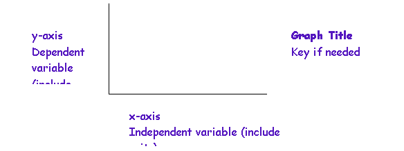
x-axis |
|
y-axis Dependent variable (include units |
|
Graph Title Key if needed |
2. Choose the scale so the graph becomes large enough to fill most of the available space on the paper.
3. Each regularly spaced division on the graph paper should equal some convenient, constant value. In general, each interval should have a value that can be easily divided visually such as 1, 2, 5, or 10, not 3, 6, 7, or 9.
4. An axis does not need to start at zero, particularly if the plotted values cluster in a narrow range not near zero.
5. Label each axis with the quantity and unit being graphed. For example and axis might be labeled "Mass, grams”.
6. Plot each point. If you plot more than one curve on the same graph, use a different color or geometric shape to distinguish each set of data.
7. For an XY graph, draw a smooth line that lies as close as possible to most of the points. Do not draw a line that connects one point to the next one as in a dot-to-dot drawing. If the curve appears to be straight, draw one continuous line with a ruler.
8. Title your graph with an informative title.
9. Remember there are many kinds of graphs. The type chosen depends on the characteristics of the data to be displayed.
a) Pie charts – show the relationship of parts to the whole.
b) Bar graphs – compare values in a category or between categories. Bar graphs can be useful to study trends over time. Multiple bar graphs compare relationships of closely related data sets.
c) Line graphs – are another way to show the relationship between two variables.
d) XY-plot (also called a scatterplot) – demonstrates a mathematical relationship between two variables. This type of graph is especially useful in scientific work. Frequently it is difficult to decide if a graph is a line graph or an XY-plot. XY-plots determine a mathematical relationship.